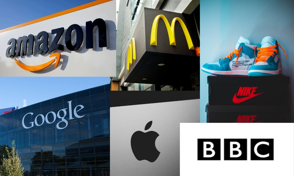
Simple logos are better because they are more adaptable. There’s nothing complex about McDonald’s golden arches, Apple’s apple, or Nike’s tick. A simple yet effective logo always fosters brand loyalty and customer recognition. The easier and simpler your logo design is to recognize, the more effective it is. Too often, designers and clients get so fixated on the logo itself that they forget about its application.
Simplicity leads a logo design in Austin, TX to get familiar with people within a short period of time. Some other opportunities that simple logo design provides your company are:
- It grabs the attention of consumers.
2.It makes a brand memorable.
3.It is the foundation of your business.
- It separates you and makes your brand stand out from other competition.
- 5. It fosters brand loyalty.
6.Simple logo brings stronger association.
However, Some renowned simple logos are given below:
Lux
The logo of Lux is straightforward and elegant. Due to these factors, the Lux brand has powerful memorability in the mind of customers.
FedEx
The FedEx logo is famous for its tricky optical illusion and simplicity. Between the letters E and X, you’ll spot a white arrow. It stands for speed, accuracy, striving for perfection, and perseverance in achieving goals. Each shade on the logo also has its meaning. It is noticeable that the “Ex” part of the name changes its color across distinct displays. It’s a witty way to distinguish the departments inside the company. For example, orange stands for FedEx Express, green is FedEx Ground’s corporate color, and red is a direct indication of FedEx Freight.
McDonald’s
The first thing that is the most noticeable about MCcDonal is the golden arches that symbolize stability. The logo of MCcdonal sticks with simplicity. This logo can be a good example of proving that the simpler the logo design, the more attractive it becomes to the viewer. People from China to South Africa know this logo because of its simplicity. It’s a single “m,” and it’s golden.
Nike Swoosh
The Nike swoosh symbol is amongst the world’s simplest effective branding visuals. This simple shape communicates movement, change, and innovation in a single, wordless shape. It provides a clear message through its simple design. The notion behind the swoosh is thoughtful – elegance lies in simplicity. At its most elementary level, the Nike Swoosh represents motion and speed.
Google’s logo is a great way to show how simply a world-changing message can be conveyed. You don’t require a whole image for that, or even something too notional. These are initially just plain letters but on further analysis.It can be seen that they feature the three primary colors in a row, with a secondary shade breaking the line. This signifies that Google doesn’t always care for the rules and sets its own guidelines on changing the world.
Amazon
The Amazon logo is such a logo that use minimalist elements in their logo design. Because Jeff Bezos didn’t want the branding design budget to be high, this didn’t affect the emblem’s recognizability and modernity, known in every corner of the Earth. This logo symbolizes its intention to sell all sorts of products on Earth.
BBC
FOR MANY YEARS, the BBC logo has been popular among us, one of the most expensive logo designs. And this can be a perfect example of a successful investment. This logo is firmly associated with reliable and fresh information in the subconscious of users. Here, designers also decided to strive for minimalism and created white letters on a black background, enclosing each letter in a square.
A logo design that uses minimal elements and keeps it simple helps a company make a lasting impression. That is why the importance of keeping a logo design simple cannot be overlooked.

